Overall Shelf Impact
- ★ Concept B94.0
- Concept A70.0
- Concept C65.0
Concept B wins on the two signals that convert at shelf: stopping power and appetite.
Composite · Concept B
Composite · Concept A
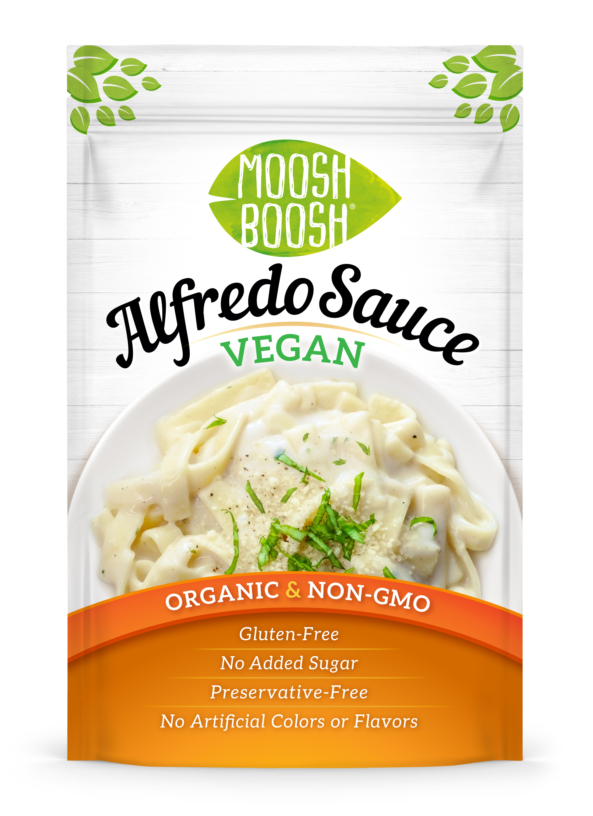
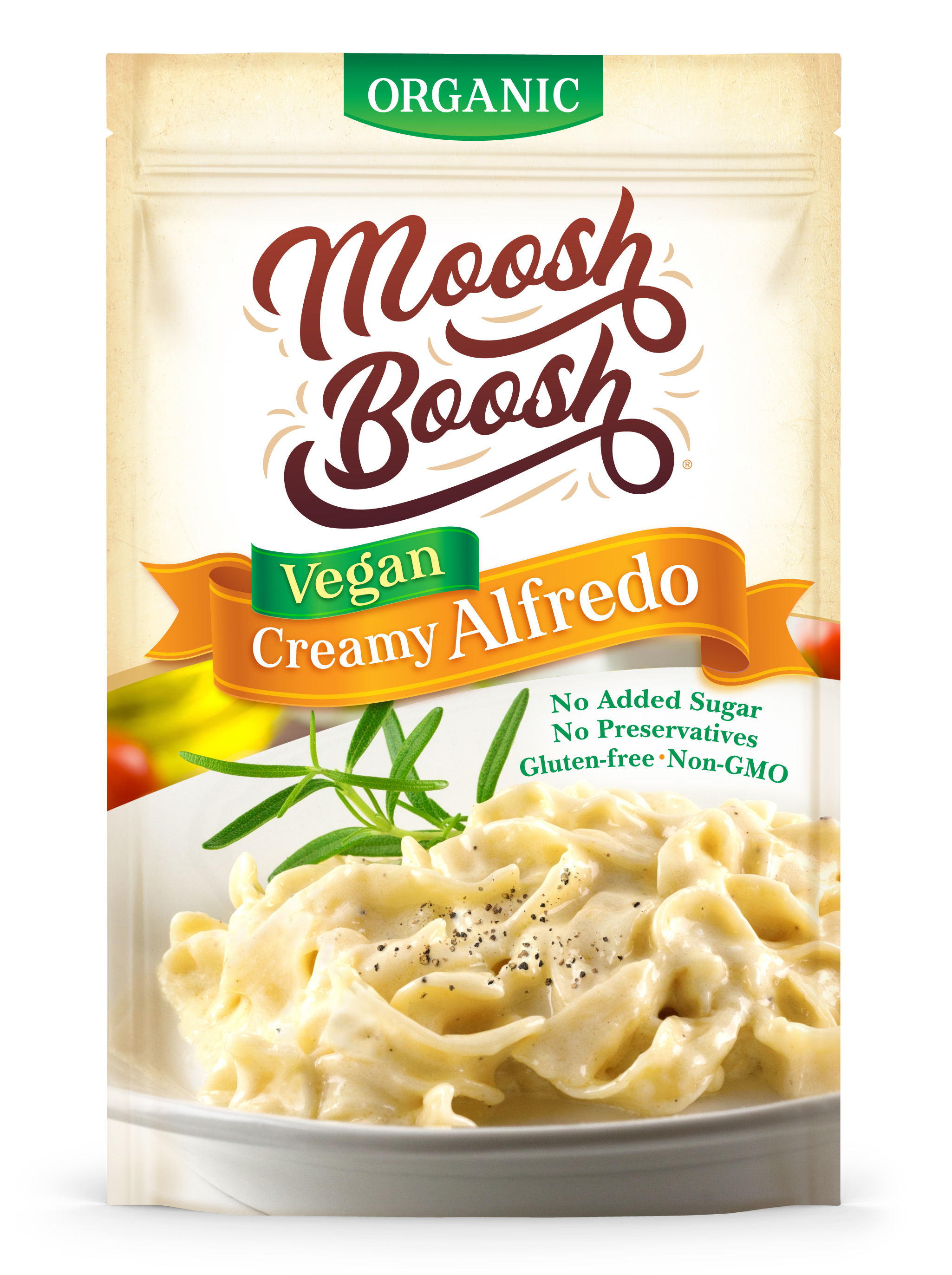
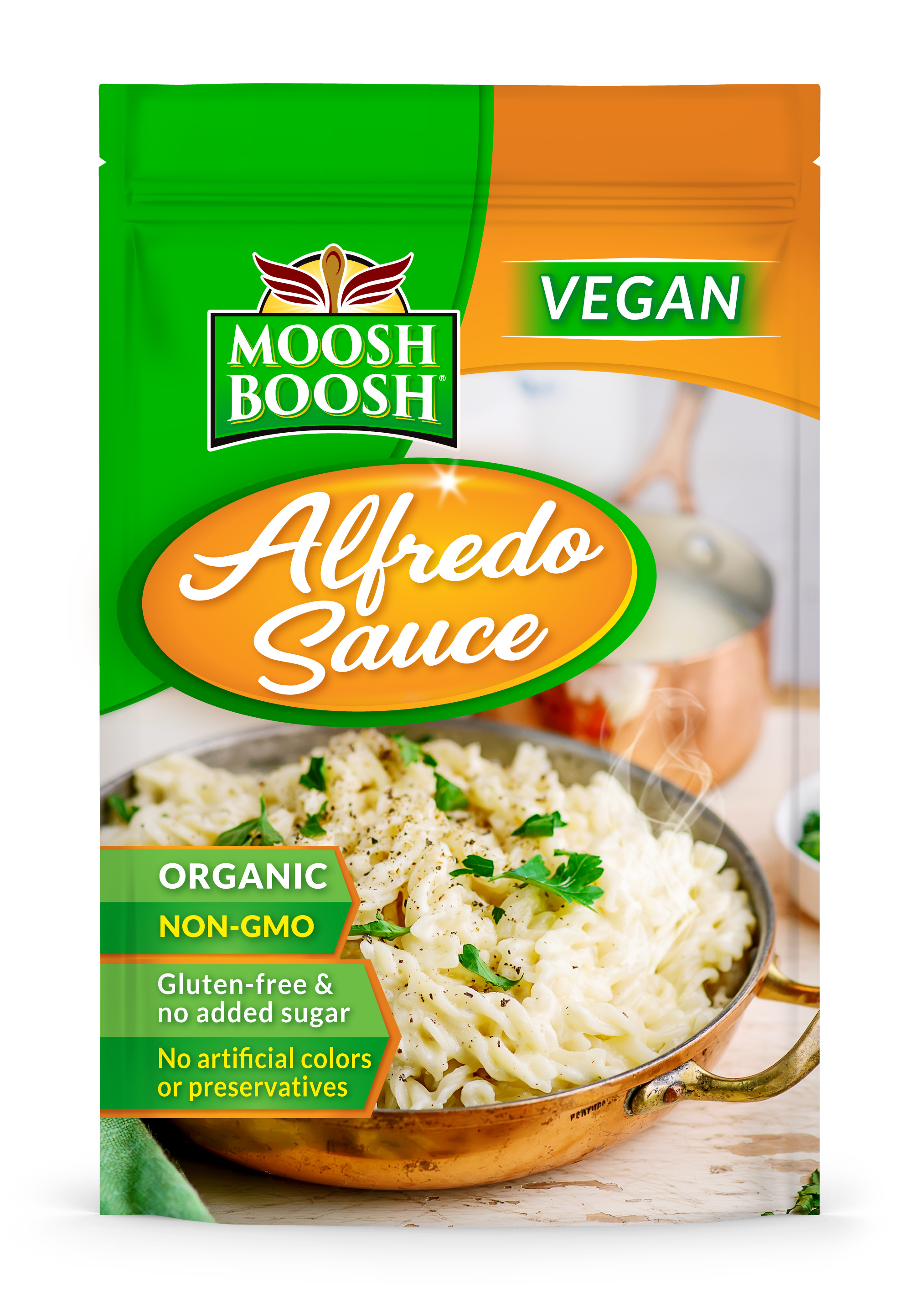
Scroll for methodology, ranking, criteria & recommendations
Each concept is scored 0–100 across ten weighted criteria by three independent AI models. Composite scores are weight-averaged — not a single chat opinion.
Does it stop the shopper at 3–6 feet? Contrast, disruption, and visual energy on shelf.
Can someone instantly read the brand and know what the product is?
Does imagery and sensory cueing trigger desire to pick it up?
Is the identity distinctive enough to own and remember later?
Does the design match the stated demographic and lifestyle?
Are claims, flavor, and variant info prioritized for fast scanning?
Does color and form stand out from comparable products nearby?
Does finish and tone signal the intended premium vs. value tier?
Does the design align with the stated retail price point?
Are there design mistakes that could quietly hurt conversion?
Judge 1
Claude (AWS Bedrock)
Narrative & shelf presence
Judge 2
GPT-4o (OpenAI)
Technical & structural
Judge 3
Llama (Perplexity)
Consumer & competitive
The color-blocked front panel owns the shelf — instant read, strong appetite cue, clear brand lockup.
Print-ready
Click a criterion to spotlight its rationale
Clean, legible, and completely at home in a category set it never escapes.
Strong contender
Click a criterion to spotlight its rationale
Ornate script and a cream field pull a premium SKU toward value-tier.
Needs work
Click a criterion to spotlight its rationale
Composite weighted scores across all ten evaluation criteria, ranked from highest to lowest — with lab instruments that make the margin visible.
Concept B
Print-ready
Print-ready
91
Concept A
Strong contender
Strong contender
72
Concept C
Needs work
Needs work
68
Shelf simulation
~ 4 FT
Visualizing product placement and visibility at retail.
Overall Shelf Impact
Brand Name & Product Clarity
Appetite Appeal / Sensory Cues
Brand Identity & Logomark
Demographic Fit
Information Architecture
Color Strategy & Differentiation
Premium vs. Value Positioning
Retailer & Price-Point Fit
Material & Finish Quality (inferred)
Overall composite
Cross-cutting patterns from this analysis — use these to guide every future packaging decision for the brand.
The 19-point gap between Concept B and Concept A comes down almost entirely to one decision: replacing a neutral photographic ground with two saturated blocks. All three judges scored that move highest, and it is the pattern to carry into every future SKU on this brand.
Concepts that placed the vegan signal in the first eye stop scored 20+ points higher on demographic fit. In an aisle where shoppers are qualifying rather than browsing, the claim works as a filter, not as a footnote.
Concept C carries the most skilled execution in the set and the lowest score. Detail that reads beautifully at arm’s length disappears at four feet and in an e-commerce grid — judge every lockup at thumbnail size before it goes to comp.
Primary direction, refinements, and backup — so you know what to ship and what to keep in reserve.
“Print Concept B and put the other two in the archive.”
Print-ready. The color-blocked front panel owns the shelf — instant read, strong appetite cue, clear brand lockup.
Strong contender. Keep as alternate if the winner needs a creative pivot.
Print Concept B and put the other two in the archive. It leads every judge on shelf impact, appetite appeal, and audience fit, and its 91 composite clears the runner-up by 19 points — a margin no realistic refinement of Concept A closes.
Before you release files, borrow one thing from Concept A: its single bottom claims band groups the certifications into one scannable strip, which is tidier than B’s stepped flags and worth testing as a B variant. Hold Concept C — the cream field and script lockup are working against the price point this SKU has to defend.
The shelf-stable vegan sauce set at natural grocery is dominated by cream, kraft, and pale-green pouches — the two national organic brands and almost all private label sit in the same low-saturation band. Concept B is the only design here that would break that run, and it does so without abandoning the organic cues shoppers use to qualify the aisle in the first place. The one risk is adjacency: if the retailer blocks this pouch beside a bold orange competitor the differentiation collapses, so ask the category manager for a green-side facing.
Three independent models scored every concept. The dissent map shows where the panel disagreed — depth you cannot fake with a single LLM pass.
Judge 3 · +12.0 pts
Concept A
Scored 84.0 vs panel average 72.0.
Narrative & shelf presence
Claude (AWS Bedrock)
Technical & structural
GPT-4o (OpenAI)
Consumer & competitive
Llama (Perplexity)
Stop guessing. Upload your designs and get a verdict in under three minutes.